As we’ve witnessed the mass popularization of minimalist aesthetics in the past few seasons, it feels as if something has gone missing from the mainstream. My theory? The magic is gone. Yes, style is subjective, but what’s irrefutable is that statement pieces are the spice of life. After all, anyone can own those traditional staples (e.g., classic button-downs, wide-leg trousers, or flat sandals), but few can style them in a way that feels signature to them. What’s missing from the current landscape is the fact that while the quiet-luxury movement has been championed by more minimalist-leaning brands, that doesn’t mean you have to approach it from that lens.
(Pictures used in this post are for the reference only, all copyrights belong to the respective owners of the images. Image sources include but not limited to – google, IG, respective fashion magazines, fashion designers, fashion models and fashion brands)
All About Prints – Spring 2024
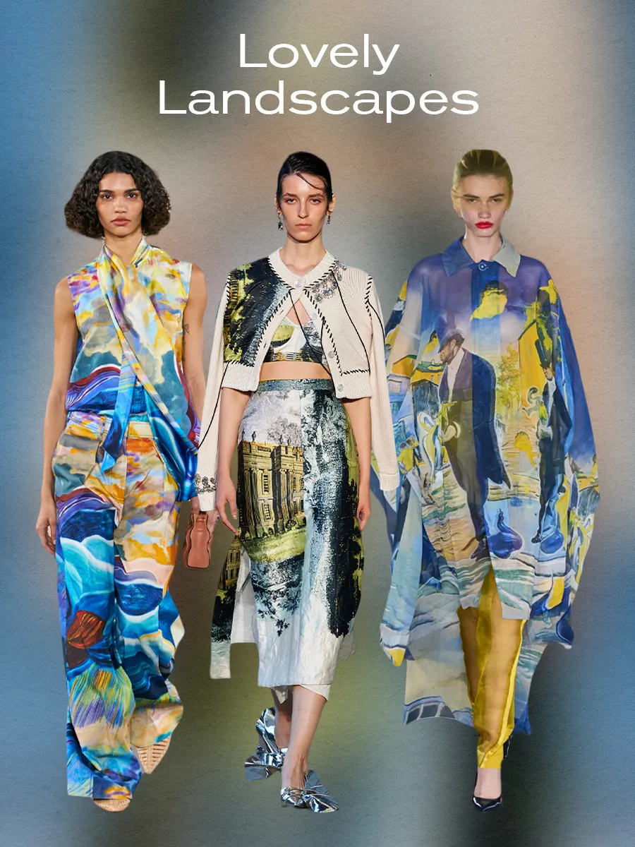
Landscapes –
Every art form reflects the world around us, but that idea was no more evident than with the debut of S/S 24 runway collections. While some designers chose to reflect the animal kingdom, thereby acting as a symbolic exploration of humans’ relationship to nature, others focused on the spaces around them (quite literally). Across various collections was a sweeping embrace of landscape-inspired prints depicting the countryside, cityscapes, and even some parts of civilization. But what made these prints distinct wasn’t just that they felt reminiscent of traditional landscape paintings and were brought to life through tailoring. A prime example was Ulla Johnson’s S/S 24 spring show, where the designer collaborated with Brooklyn-based artist Shara Hughes to turn various paintings into prints. As explained in the show notes, the collection was “profoundly inspired by the interconnectedness of art forms.” That aim was felt in how the whimsical watercolor strokes suddenly became sharper with tailored separates, such as a landscape print satin pussy-bow blouse with matching relaxed trousers.
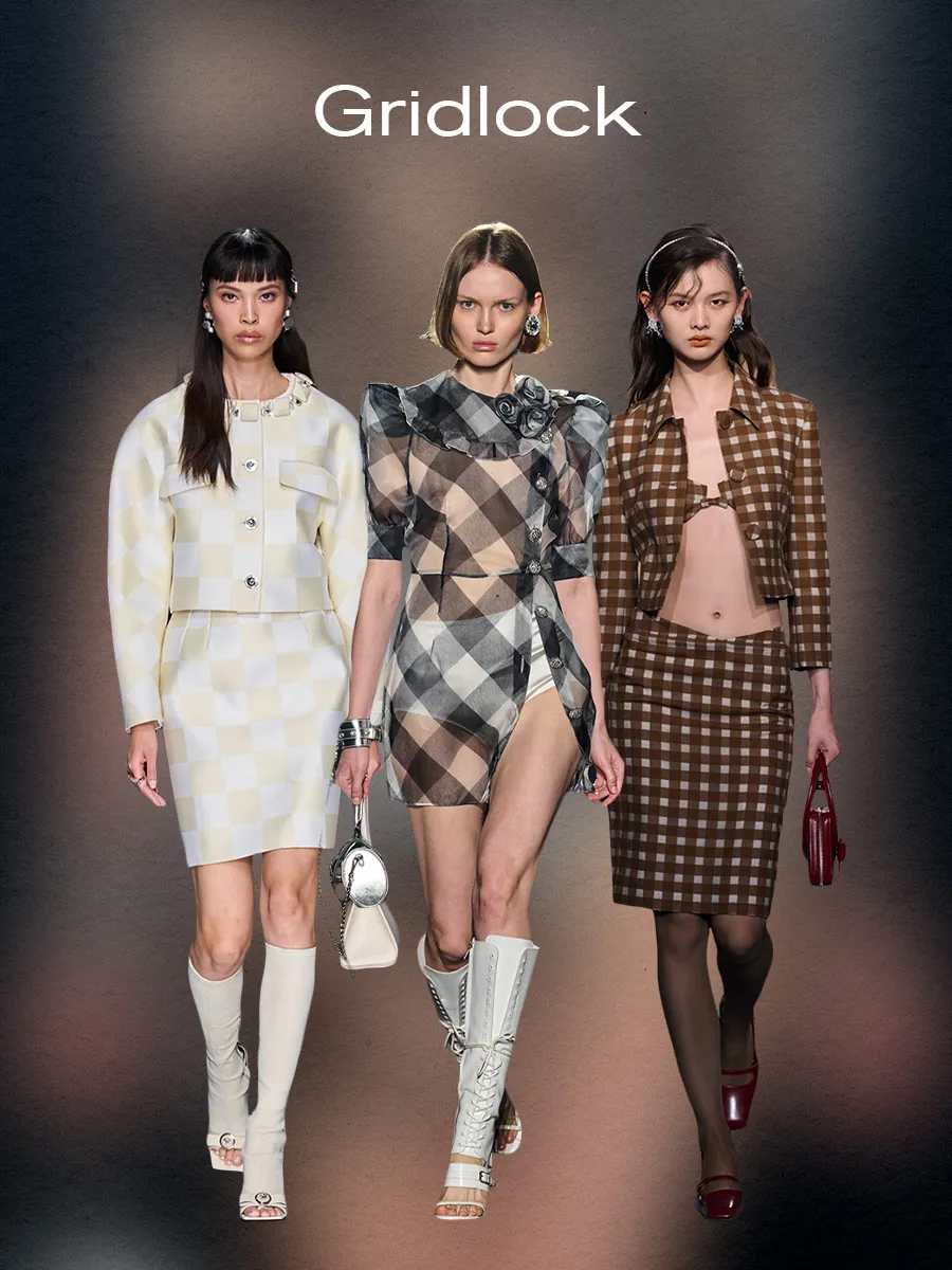
Gridlock –
Grid-inspired patterns? It’s a given that once spring rolls around, gingham and checkerboard prints happen to come back. While it’s true that these prints can sometimes feel passé (they’re often what one imagines wearing on a picnic in the park on a warm spring day), any former connotations of this print being the embodiment of “sweet” were swept under the rug this season. Designers showed how provocative and powerful this print can be by adopting sultry silhouettes, streamlined shades, and sheer materials. With the Shanghai-based brand ShuShu/Tong, they noted that the inspiration for their S/S 24 was Helmut Lang’s “Big Nude” photograph and that it was “the central theme of the collection, for what signals it [the photograph] conveys are not of sensuality but rather a vibrant expression of female power… The collection explores the edge deeply rooted in every woman’s body, unveiling their authentic, and perhaps concealed, strength.” What better way to display women’s “soft power” than taking a gingham print and applying it to a low-slung form-fitting pencil skirt with a matching cropped coat and exposed bra top? The outcome was a series of runway looks that allowed us to think outside the box and redefine what “femininity” and “power” look like, one printed piece at a time.
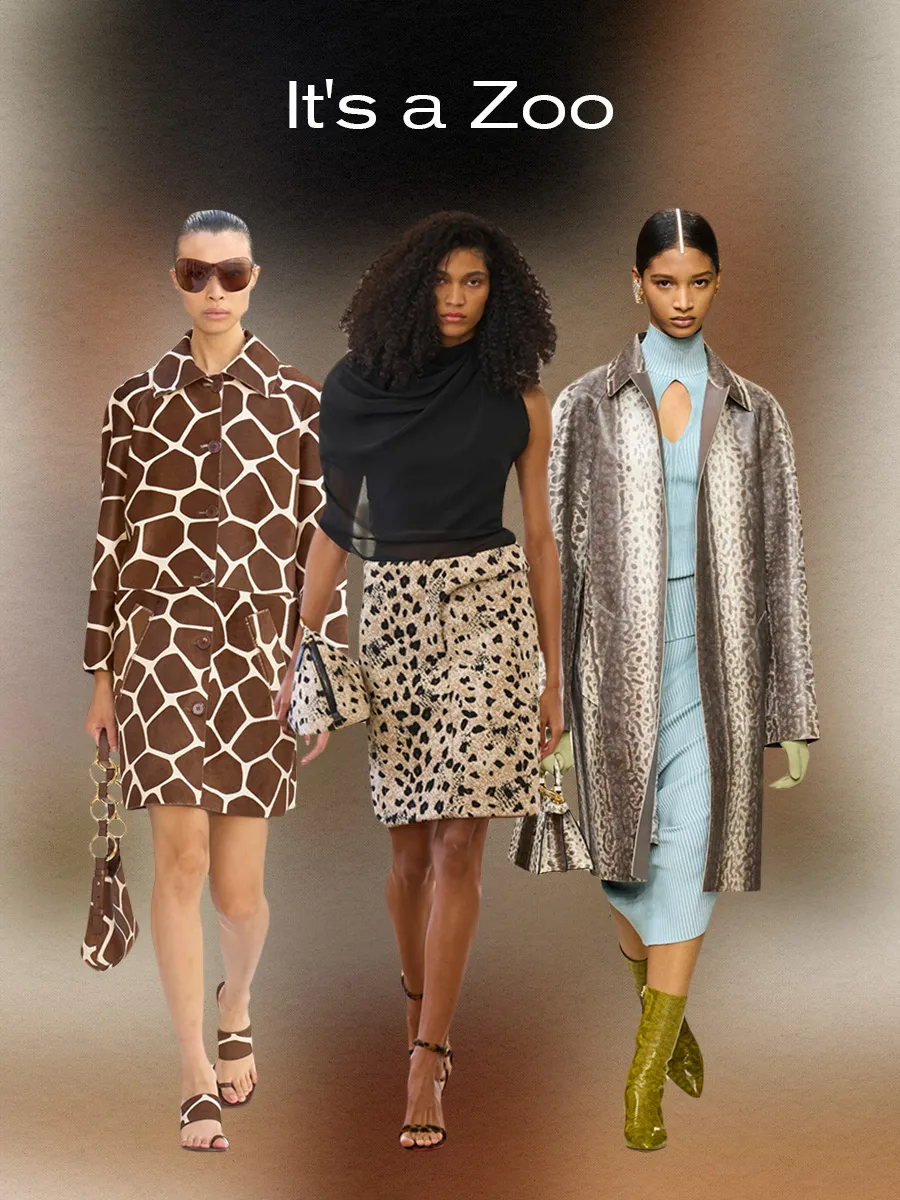
It’s a Zoo –
Heard of the jungle theme recently? I hope everyone is back from Jamnagar 🙂 I know it was a celebration of a century and how gorgeous the couple #Anant and #Radhika looked in every single attire. Coming back to the point – The animal print. What’s kept this trend at the top of the fashion kingdom is how it has continuously evolved, even in more recent seasons. Typically, loud by nature, animal prints aren’t exactly the quietest thing you can wear, yet this season, it felt as if these patterns were shedding their previous connotations in lieu of becoming a bit more domesticated. Leopard prints felt far tamer, thanks to their adaptation into tailored separates, including a low-slung pencil skirt, hourglass trench coat, strappy sandals, and structured bags at Jacquemus. Similarly, snakeskin was given a softer feel in Fendi’s spring collection by pairing a serpent-inspired print coat with seafoam green gloves, a pastel blue knit top, and a matching skirt. And then, there was Michael Kors’ collection, which brought back giraffe print in the form of a pony-hair peacoat with a matching crescent-shaped bag and sandals. Although every designer had their animal print of choice, overall, each managed to contain the prints to the confines of the Zoo (or, in this case, the fashion world).
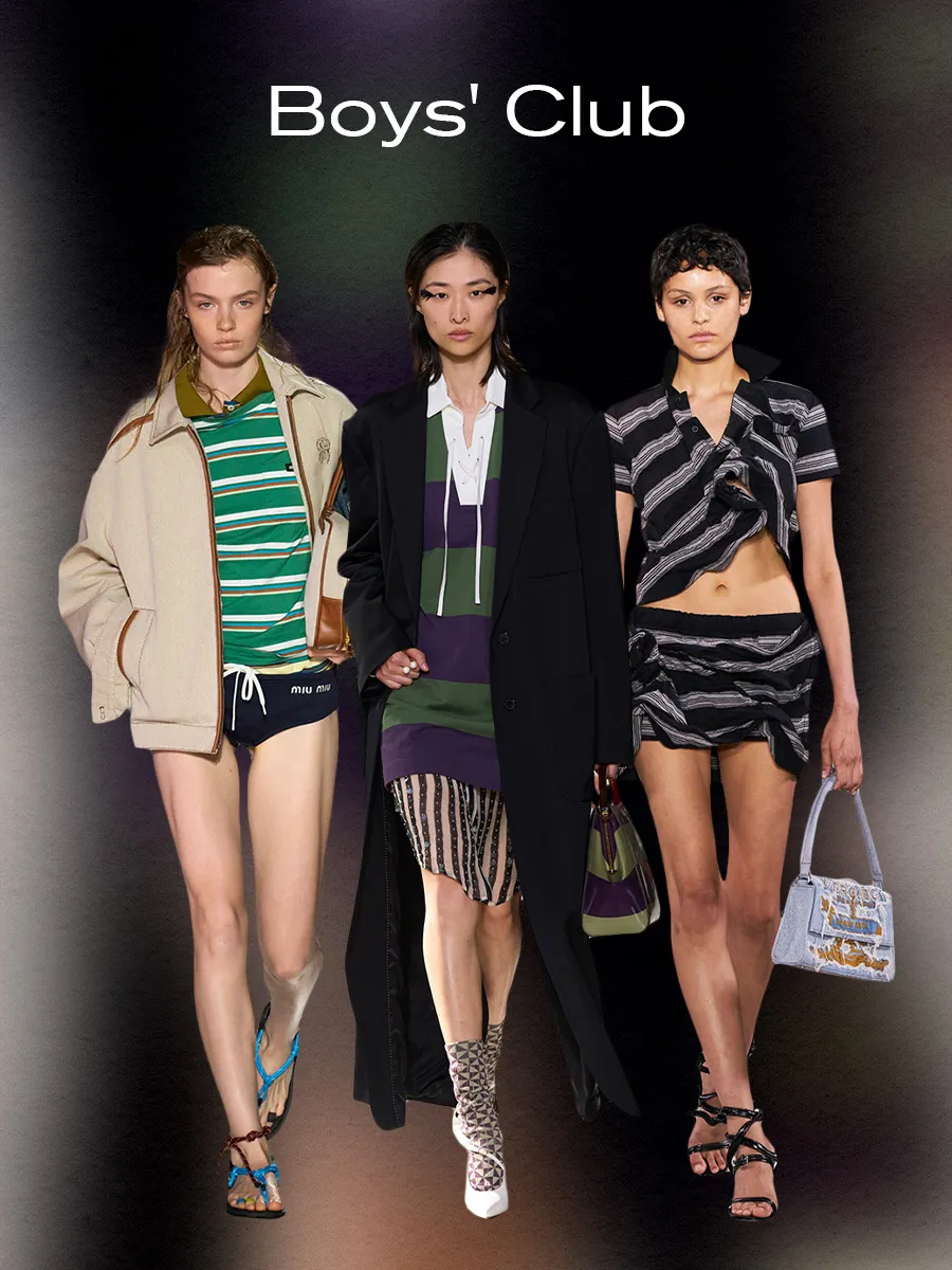
Boys’ Club –
We’ve begun to see designers incorporate more “boyish” elements into their recent collections, including one particular print: rugby stripes. As antithetical as it might seem at first glance, as more “feminine” details have dominated the zeitgeist, it’s also given designers the space to grapple with the more “masculine” elements of style. That’s reflected throughout S/S 24 collections, as designers took this print rooted in sportswear and academic fashion aesthetics and turned it on its head. Or at least, that was the aim of Dries Van Noten’s collection, which noted in their press release that the intention was to have “Notions of tradition re-imagined and re-energized, to develop a continued conversation exploring the tension of contrasting ideas coming together to create something spontaneous and free-thinking.” That aim was evident in how sports attire was transformed in unusual ways to create a “feminine expression of men’s tailoring”. we saw the more “tomboy” approach to womenswear adopted in Y/Project’s spring collection, as one model wore a crinkled-up cropped striped polo styled with a matching mini skirt, strappy sandals, and a denim bag. Ultimately, incorporating this print trend into collections paired with a more “disheveled” styling gave the illusion that the mere adoption of this trend could allow one to infiltrate the boys’ club or, at the very least, challenge the status quo.
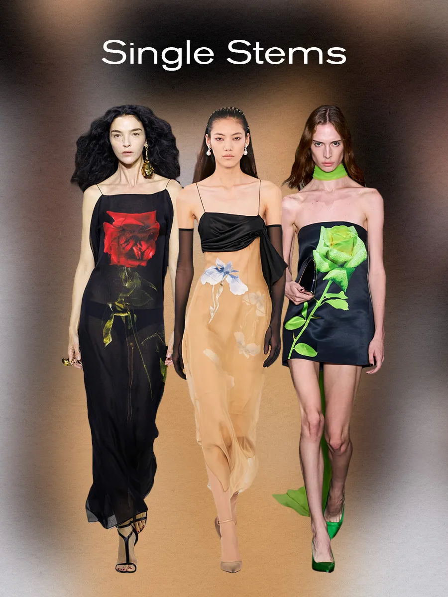
Single Stems –
With recent collections, there seemed to be a collective shift away from the floral print pieces of our adolescence to something more grown. It was less about wearing the “frillier” over-the-top floral pieces covered in the motif and more about taking a more minimalist approach, reflected through the adoption of single-stem floral prints. Just to be clear, these floral print pieces are just as pretty as the ones of the “past.” But instead of relying upon more flowers to get the print’s point across, designers used tints and textiles to make them stand out. For example, in David Koma’s collection, color was used to make the print contemporary, a single oversize acid-green rose adorns the front of a black satin shift dress. Similarly, at Alexander McQueen, we saw the color of the print and the textile it was printed on make it stand out. The overall result was a series of prints that single-handedly made florals feel fashion-forward again.

Quiet Luxury? Who? –
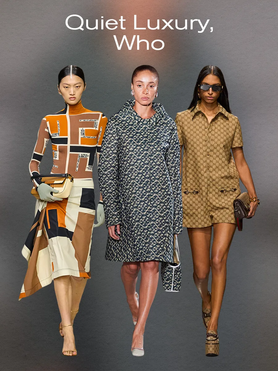
No matter how many tabs you open on the internet, one trend has seemed inescapable of late: quiet luxury. Whether you’re a fan or not, chances are you’ve been unable to ignore how we’ve seen a collective push towards more minimalist fashion aesthetics. That’s been embodied through muted colors, limited patterns, streamlined silhouettes, and not overtly “flamboyant” or “flashy” items. we’ve reached a point where the pendulum is about to swing again, case in point: the return of monogram motifs. One could imagine that when designers sat at the cutting tables to create their collections, it wasn’t just that logos adorned accessories, but they were everywhere in ready-to-wear collections. For example, in Fendi’s S/S 24 collection, Kim Jones drew from the house’s archival prints by bringing back the color-blocking interlocking “FF” logo prints that were popular in the ‘90s. And then, there was Sabato De Sarno’s debut collection for Gucci, which paid homage to the house’s history by incorporating the iconic interlocking “GG” logo into everything from patent leather shift dresses with embossed logo prints to jacquard weave boiler jumpsuits. The result was a series of collections that put a sell-by date on the quiet luxury movement.
Mismatched –
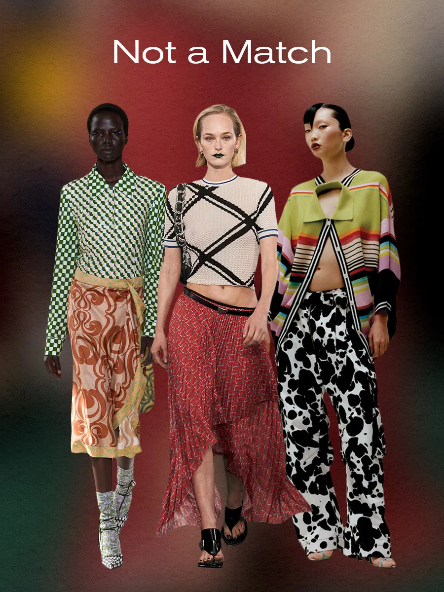
Designers did the most by embracing mismatched prints. While mixing patterns isn’t necessarily a brand-new concept, with so much of the cultural conversation currently favoring choosing “functional” items over “fun” ones in fashion, the embrace of this styling trend was a breath of fresh air. Especially considering that designers didn’t necessarily follow some of the unspoken “rules” about mixing patterns—e.g., choosing patterns in the same color family or breaking up the look with solid colors. Rather, we saw designers choose to pair prints that were not a match to draw attention to the pieces’ textures and tailoring. Take, for example, Dries Van Noten’s spring collection, which featured head-to-toe mismatched patterns. Most notably, there was one look that made the subtle sequin embellishments on a green checkboard button-down shirt stand out even more by styling it with a contrasting silk wrap skirt made from two different prints, printed socks, and wavy print heels. Never one to shy away from color and prints, we’ve become accustomed to this designer’s unique ability to use details to show off his design prowess, the recent S/S 24 collection being no exception to this rule. In the collection, we saw many patterns, colors, and textures, most notably in the form of a pair of cargo pants with a splattered black and white print paired with a deconstructed polo in a multi-color stripe. The look exemplified the aim of the “not a match” styling aesthetic, which is to draw attention to the details that make each garment unique. We give so much lip service to the idea that “less is more,” but with this print trend, we were reminded that just because clothing isn’t minimal, it doesn’t mean it lacks intention.
Contemporary Chevron –
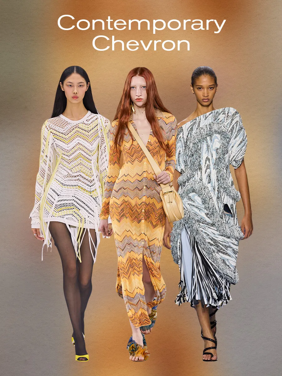
Some print trends don’t always feel contemporary, and chevron can be one of them at times. First popularized during the Art Deco movement through the ’20s and ’30s, the print is characterized by its signature zig-zag pattern, typically created by weaving techniques. As fashion became more commercialized over the last century, many weaving techniques central to creating chevron were ditched in lieu of cheaper methods (aka screen printing), thus making this print feel less chic. But in recent years, we’ve seen luxury houses make craftsmanship cool again, thereby charting the inevitable comeback of chevron. We saw this print in various S/S 24 runway shows, including the Italian fashion house synonymous with the motif for years: Missoni. Although the brand has used this pattern since the ’50s, it feels mainly rooted in the present day because of how playful its interpretations are in the collection. The brand’s show notes noted, “This collection arises from a cheerful question: How do you enjoy reality? The answer materializes in exploring the joys of matter, shape, and color.”
And that’s the end:)
